Case study · AI in practice
Designing with AI, from component to agent.
How a code-connected design system, a production-grade UI Kit and my own design rules became skills anyone on the team can build from.
Context
Building on a design system wired to code
As part of the DesignOps team, we rebuilt the design system as ODS 2.0, a Figma library that matches the Angular component library one to one and is linked to the code through Code Connect. When a designer uses a component, developers see the exact snippet behind it.
A library only pays off if pages get built with it. With the component library done, I’m now recreating live commerce pages in the UI Kit, assembling them only from code-connected components and feeding what’s missing back to the library owner.
01 · Components · How the team built ODS 2.0
A design system that speaks Angular
The goal was to build ODS 2.0 design system, a Figma library at one-to-one parity with the Angular Component Library, so the component a designer places is the component a developer ships. Everything I build sits on top of it.
48
Code Connect files live in Figma Dev Mode as of July 2026
38
components tracked with handoff, accessibility and maturity reports
8
steps in the component pipeline, each one a quality gate before the next
9
review stages per component, with designer and developer sign-off before it’s published
The component pipeline
Every component, the same way
Standardising the steps is what makes the library consistent. Each component comes out as a Figma component set, a Code Connect file in the Angular repo, a developer handoff doc and a usage page in Zeroheight.
The team uses Claude skills for the repeatable parts: generating handoff, accessibility and maturity reports, and the contributor skills I use to build pages and patterns.
01
Discovery
Read the Angular source: inputs, slots, states
02
Build in Figma
Variants, properties, tokens
03
Manual steps
Slots and fonts
04
Code Connect.figma.ts mapped to the real inputs
05
Developer handoff
Every input with its type and default, gap log
06
Audits
Accessibility · maturity · responsive · tokens
07
QA
Designer review, then developer sign-off
08
Ship
Published library, live in Dev Mode
Built for code generation
Figma names match code names
The validation checklist is strict about naming because Dev Mode depends on it. Figma properties use the Angular @Input() names exactly, layers follow the library’s BEM classes, and the Code Syntax field carries the real CSS class.
| Figma property | Angular @Input() |
|---|---|
size | size |
hasIcon | hasIcon |
| Rejected, no matching input |
Zero hardcoding
No raw hex or pixel values. Spacing comes only from layout variables.
Resilient slots
Flexible content goes through named ↳ slot: layers and is tested so swaps never break padding.
AODA states
Focus, loading, empty and error states on every interactive component. Hover alone is never enough.
Localization
Layouts allow 20–30% more room for French.
Prototype-ready
Checkboxes, toggles and radios switch state inside the component, so you don’t need extra frames.
Decisions logged
Architecture choices are recorded as ADRs, for example whether breakpoint becomes a Figma variant when a layout reflows.
02 · Library · Design to code
Carrying the code connection all the way to the page
A code-connected library only matters if real pages keep the connection. I own the layers between the library and a designer’s mock, and I built them so nothing breaks the link to code.
Code
Angular library
Source of truth
Library
ODS 2.0 components
Code Connect
Mine
Cart patterns
Pattern Library
Mine
Page templates
UI Kit
Mine
Skills
Cart, p2p journey, order details, copy sync
Output
Designer mock
Dev Mode shows the Angular snippet
Because nothing is detached, every component in a skill-built mock still opens to its Angular snippet in Dev Mode.
Live site → Figma
Reverse-engineering production
The agent measures the live page’s DOM and CSS at 1440, 768 and 375 and records what changes at each breakpoint. Copy comes straight from the site’s language files. That’s how we found where production uses custom code instead of library components, which shaped how we built the patterns.
Figma → dev
Production defects with real measurements
When production drifts from the pattern, I write it up for developers as UI defects with numbers. Each one names the breakpoint, what production does and what it should do, measured in pixels. Sixteen are logged so far.
Figma → library
Feeding gaps back to the system
Anything the library can’t do yet goes to the library owner as a component-library defect or a token gap, not a local workaround. My cart work raised 15 component-library defects and 3 style and token gaps, and the patterns passed the token-audit gate before publishing.
Figma → code
Working prototypes from designs
I turned the one-time-passcode sign-in designs into a React and TypeScript prototype with all eight states: empty, typing, filled, verifying, invalid, expired, new code sent and API error. Paste and keyboard navigation work, so we tested the edge states rather than just looking at them.
Content → Figma
Copy with stable keys
I set up an EN/FR copy deck template in Confluence and the first step of a copy sync skill. Copy is keyed to named Figma text layers, so the skill can diff approved copy against the design and apply it without detaching a single instance.
Documentation
Guides the team can read
Each template ships with a designer guide covering which frame to start from, which properties to switch and what’s still a gap. There’s also a page explaining how the cart skill fits with production, the Pattern Library and the UI Kit.
03 · UI pages · UI Kit
A UI Kit that mirrors production
I’m building the UI Kit for every section of the site using ODS 2.0 components, with each page mirroring what customers see in production. Designers start from a real, code-connected page rather than an approximation. I started with the path to purchase: the product page, Cart & Checkout, Order Confirmation and Order Details.
How I build a page
01
Read production
The agent measures the live page in a browser at 1440, 768 and 375 pixels: spacing, columns, what reflows and what’s hidden.
02
Rebuild with ODS 2.0
Every frame is assembled from published components. Nothing gets detached. Gaps are fixed with instance overrides or not at all.
03
Log the gaps
What the library can’t do goes to the library owner. What production gets wrong goes to dev, as UI defects.
04
Promote patterns
Repeated layouts become patterns with deliberate properties, gated by a token audit before they’re published.
05
Encode a skill
Business rules and my design decisions go into a skill, so the next cart is built from a brief rather than from memory.
Cart & Checkout
The cart, from live replica to a skill
The cart is mostly app-side code with its own rules for fulfillment, fees and alerts. Mocks drifted from production because those rules lived in people’s heads. I rebuilt the cart from the live site, fixed the patterns first, and then wrote the rules down where the agent could follow them.
| States | Same day, Scheduled, Ship to Home with or without assembly, Appliance with services, Store Pick-Up, Ship to Store, and every fulfillment together |
| Breakpoints | 1440, 768 and 375, with what each one changes recorded in a delta table |
| Patterns | Fulfillment options, fulfillment header, order summary, appliance services |
| Reporting | Gap report taken through 15 reviewed versions in 13 days. 16 production UI defects written up for dev. |
Order Management
Order Details as one configurable template
Post-purchase pages have many states and almost no documentation. I rebuilt them from real orders, with placeholder customer data, and turned the variation into components a designer can switch rather than frames they have to hunt for.
When the agent suggested putting a Track button inside every status variant, I said no. Components stay single-purpose. Optional elements sit beside them as hidden layers.
| Fulfillments | Scheduled, Ship to Home, Appliance, Same day, Ship to Store and Store Pick-Up |
| Flows | Cancel item drawer, cancel success with floating alert, cancelled state, important delivery info open and closed |
| Components | Status per fulfillment, a header per fulfillment with conditional tracking, delivery-info accordion |
| Notifications | Hidden, type-switchable alert slots across 21 frames, blue by default |
| Side output | A UX debt log for live accessibility and flow issues, kept apart from design-system gaps |
04 · Skills · Authored by me
My design decisions, written so a machine can follow them
cart-ui
Builds any cart state in the UI Kit from a one-line brief. It covers six fulfillment types and three breakpoints and reuses published patterns.
- Encodes alert eligibility, fee display, group order and summary math
- Never invents a fulfillment and asks when the wording is ambiguous
- Checks its own output with screenshots and recalculated totals
- Has a guide, a “how it fits together” page, and a portable package for the team
SKILL.md rules.md products.md figma-gotchas.md
path-to-purchase
Builds a consistent PIP → Cart → Checkout → Confirmation → Details journey for any fulfillment, on top of cart-ui.
- Two short rounds of questions: pages first, then fulfillment and breakpoints
- Fixes one data set before touching Figma and reuses it on every screen
- Reports its assumptions rather than hiding them
SKILL.md journey-rules.md sources.md figma-gotchas.md
order-details-ui
Builds Order Details pages for the fulfillments and statuses a designer picks, at desktop, tablet or mobile.
- With one fulfillment, builds a single status or the whole journey, one page per status from Ordered to Delivered or Picked Up
- With several, builds every group in Ordered and reminds the designer which properties to switch
- Reads the Order Details rules page live, so the rules have one source of truth
- Now powers the Order Details step of path-to-purchase
SKILL.md sources.md order-details-rules.md
copy-sync v0.1
The first step of syncing approved copy from Confluence to Figma. It starts a project’s EN/FR copy deck from the team template.
- Asks for the project, site sections and fulfillments, then creates the deck
- Keys every line of copy to a named Figma text layer
- Next: seed the deck from Figma, check for differences, and apply approved copy
SKILL.md copy deck template
See it run
From a one-line brief to checked frames
The skill reads the rules, products and Figma gotchas, works out group order, alerts and fees, then builds and checks its own output.
› build cart UI with 1 Same day and 1 STH, desktop and mobile, on my test pagecart-ui reading rules · products · figma gotchas group order Same day → Ship to Home (by arrival date) alerts 1 page-level, 1 card-level (STH item eligible for 3-hour) fees per fulfillment · summary and tax recalculated grids kept, hiddenbuilt Cart — Same day + STH — Desktop Cart — Same day + STH — Mobilechecked screenshots per group · totals read back
An illustrative run. The skill asks for destination, breakpoints and fulfillment only when they’re missing. Then it builds with no confirm step, because that’s how I wanted it to work.
Path to purchase
One story across five pages
A second skill builds the whole journey with the same product, dates and totals on every screen. Designers pick the pages they need, grouped as pre-purchase and post-purchase, then the fulfillment and breakpoints. Pages with no source yet are adapted from the closest one and flagged as unverified.
PIP
Product page
Cart
Via cart-ui
Checkout
Delivery · payment
Confirmation
Order placed
Details
Order status
One data set: product · arrival date · subtotal · HST · total
How cart-ui evolved
Each correction became a rule
I built the skill for myself first, reviewed every output, and only then made it team-ready. Most of its rules came from me catching something the agent got wrong.
Oct 14
First version. Always ask for the fulfillment of every item and never assume it.
Oct 14
A single item shows its price, not “flat fee”. Groups are ordered by arrival date, Same day first.
Oct 15
Dropped the plan-and-confirm step. Ask only what’s missing, then build.
Oct 16
Layout grids are kept but hidden on every new mock.
Oct 19
Guide written, stale rules cleaned up, how-it-fits-together page published.
Oct 21
Checked for portability and packaged so other designers can install it.
05 · Figma agents · Motion
Animating using Figma agent/Figma Motion
While working on one of my recent projects, Track My Truck, we proposed animation on the progress bar. A static progress bar can’t show that something is on its way. I used Figma’s motion tools, driven through the Figma agent, to animate the progress bar between delivery milestones directly in the design file.
I set the intent: what moves, in what order, how fast. The agent wrote the keyframes and easing. Developers get motion they can inspect, not a description of it.
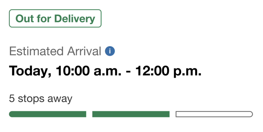
Illustration of the idea. The real animation lives in the Track My Truck Figma file.
Judgment
Where I steered the AI
The agent is fast. Knowing what to ignore, what to protect and when to stop is still the designer’s job.
“Focus on UI and not data points.”
Reviews against production compare layout, spacing and components. Prices and dates in a mock are not findings.
“Do not detach ODS components.”
Every fix is an instance override. If the library can’t do it, it becomes a library request, not a local hack.
“I think not everything needs a pattern.”
Patterns earn their place. I push back when a one-off layout gets promoted just because the agent can do it.
“List the gaps. Do not fix anything until I say.”
Diagnosis and change stay separate steps. I review drafts before anything reaches Confluence or a team channel.
“Close to production, but also follow ODS 2.0.”
Patterns match what customers see and stay inside the system, and any difference between the two gets written down.
“Expose properties they can configure on each level.”
Component properties are designed for the designer using them, not as a dump of every internal frame.
What I learned
Define the system first. Let the agent do the assembly.
Patterns before pages. I fixed the cart patterns first and only then rebuilt the cart. Telling the agent how a pattern should behave gives far better results than letting it work that out.
Always double-check mocks. The agent is confident when it’s wrong. A “no footer” finding turned out to be a lazy-loaded footer, which I caught from my own screenshot. Every skill now checks its own output with screenshots.
Corrections are product decisions. Whenever I correct the agent, I ask whether it should become a rule. That’s how the skills got better and how what I know became something the team can use.
What I’m exploring now
In progress
Copy from Confluence to Figma. Building the rest of the copy sync skill (seed, check and apply) and piloting it on upcoming projects before rolling it out to other flows.
Exploring
More Figma Motion and agents. Exploring how I can use Figma Motion and Figma agents in upcoming projects, with the same approach: design decisions first, automation second.
Tools: Claude Code, Figma MCP, Figma ODS 2.0 and Code Connect, Confluence. Product names and data in mocks are placeholders.

