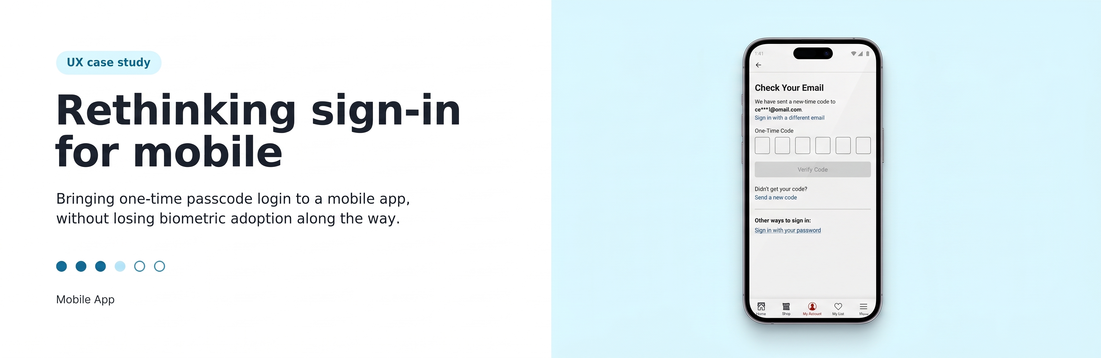
By introducing streamlined OTP without impacting biometric flow, we fundamentally transformed how users access our app.

Here is a look into the research, strategy, and native OS integrations that made our authentication smoother than ever.
Team
Designer, Project Manager, App Team, developers
My Role
Research, Design, Testing, Stakeholder management, annotate designs, UAT
Timelines
1 Month
+ Developement time
Overview
Home Depot’s mobile app used to support two sign-in paths: password-based login and biometric login (Face ID/Touch ID). The company had already begun rolling out OTP (one-time passcode) sign-in on the website, and this project explored bringing that same OTP option to the native mobile app without undermining the adoption of biometrics, which is the faster, more frictionless option once set up.
Problem Statement
Despite the app supporting biometrics for faster login, 60% of mobile users still rely on password-based sign-in. With OTP launching on the web experience, there was a clear opportunity to simplify login for mobile users too.
The complication: users who sign in via OTP can’t directly enroll in Face ID or fingerprint from that flow, so introducing OTP risked pulling users away from biometric enrollment rather than toward it.
Goal
Build a simplified, native OTP login experience for users who aren’t using biometrics while keeping biometric authentication the preferred, default method for users who’ve already enrolled. The core design tension: introduce an easier entry point (OTP) without eroding the seamlessness that biometric users already enjoy
Enrolling customers through OTP should still maintain biometric adoption at lesst 40%+ — i.e., OTP should widen the on-ramp for non-biometric users without cannibalizing the biometric base.
Current Experience Baseline Insights
I started with mapping out the current user journey and identified the highest points of friction.

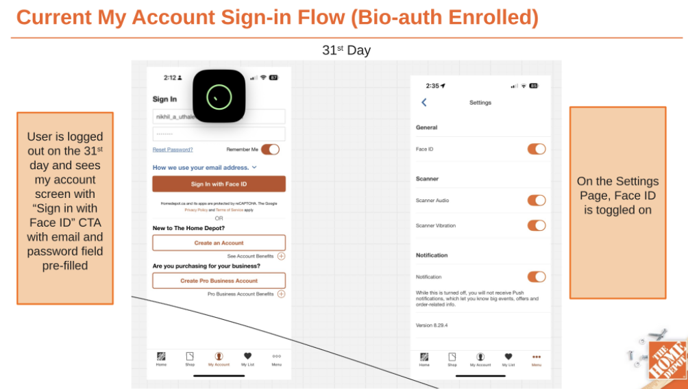
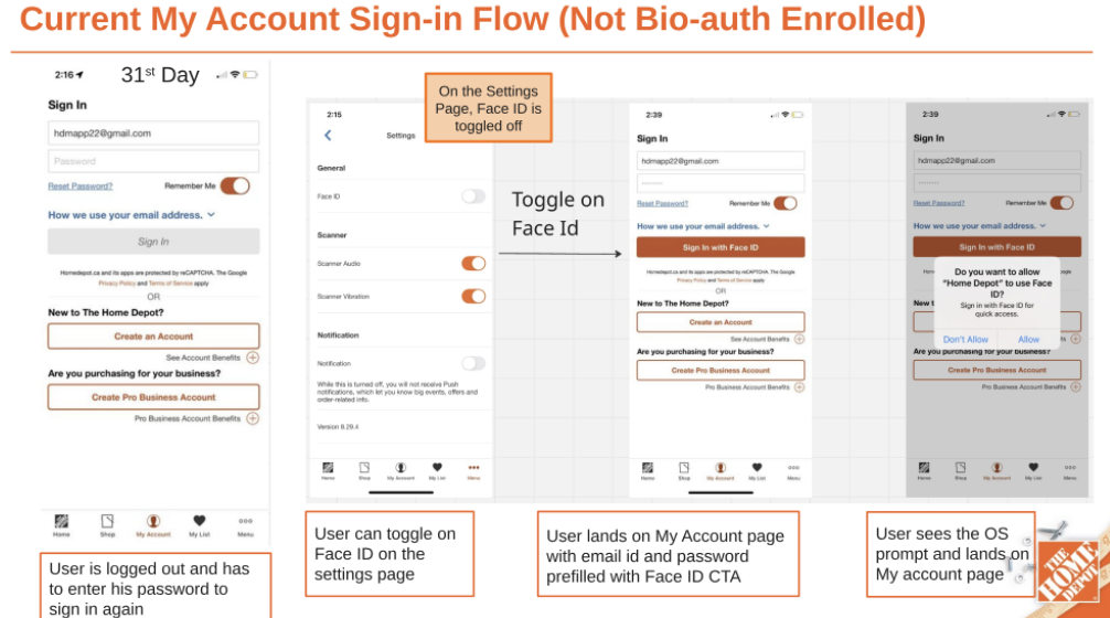
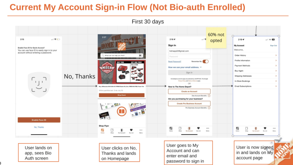
The app currently forces a usability divide: 40% of users enjoy frictionless biometric logins, while 60% reject upfront enrollment and suffer repetitive manual logins.
- Not Enrolled (60%): Users decline the initial Face ID prompt, forcing manual email/password entry every session. By Day 31, they must actively dig into Settings to enable biometrics.
- Enrolled (40%): Users accept the initial prompt, clearing the OS permission dialog for instant access. Returning sessions offer the fastest, most frictionless path: a 1-tap “Sign In with Face ID” flow.
This confirmed the app’s underlying tension: biometrics are fast but only reach 40% of users; the remaining 60% are stuck re-entering credentials manually every session.
Secondary Research
To establish a research-backed foundation for our native authentication flow, I benchmarked our strategy against usability studies from Nielsen Norman Group (NN/g) and Baymard Institute, alongside OS-level standards from Apple’s Human Interface Guidelines (HIG) and Google Material Design. The goal was to understand how to minimize OTP retrieval cost, leverage native device behaviors, and balance user preference for biometrics. The core takeaways that shaped our design strategy include:
The Mobile Typing Penalty: Entering credentials on mobile takes nearly 2x longer than on desktop (Univ. of Munich/NN/g), validating the urgent need to replace complex passwords with simplified, low-input OTP flows.
Biometrics as the Baseline: While OTP provides a strong passwordless alternative, 83% of users now utilize biometric authentication at least occasionally (NN/g). A successful login architecture must offer a flexible Biometric + OTP hybrid approach rather than forcing a single method.
Flexibility & Clear Feedback: Users should never be locked into a single authentication method. When errors do occur, precise, inline feedback rather than generic error states prevents frustration and guessing loops (Baymard Institute)
Competitor Analysis
Looking across Bank of America, Manulife, Canadian Tire (Triangle ID), RBC, Avion Rewards, Microsoft, Google, and Lowe’s, a clear pattern emerges:
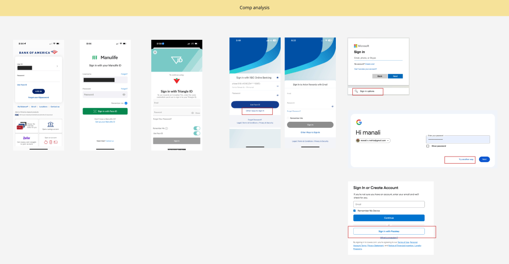
| Pattern | Examples | Takeaway |
|---|---|---|
| Password stays the default, primary field | BoA, Manulife, Triangle ID, RBC, Avion, Lowe’s | None of these competitors lead with OTP as the first thing a user sees — it’s always secondary. |
| Biometric/passkey is offered as a one-tap upgrade, not a replacement | RBC (“Use Face ID” as primary button), BoA (“Use Face ID” link), Manulife (green “Sign in with Face ID” CTA) | Biometrics is visually promoted above password entry once enrolled — same as Home Depot’s current pattern. |
| Alternative sign-in methods are tucked behind a secondary link, not a second field | RBC “Other ways to sign in,” Microsoft “Sign-in options,” Google “Try another way,” Avion “Other Ways to Sign In” | This is the strongest, most consistent pattern. Every competitor treats alternate auth (OTP, security key, backup code) as a progressive disclosure — one tap away, never crowding the first screen. |
| Passkey is being pushed as the modern default over OTP | Lowe’s “Sign in with Passkey” (boxed, secondary but prominent), Microsoft/Google passkey-first flows | Lowe’s — a direct competitor — already surfaces passkey as a peer option to password, which suggests OTP alone may be a transitional step rather than an end state. |
Ideation
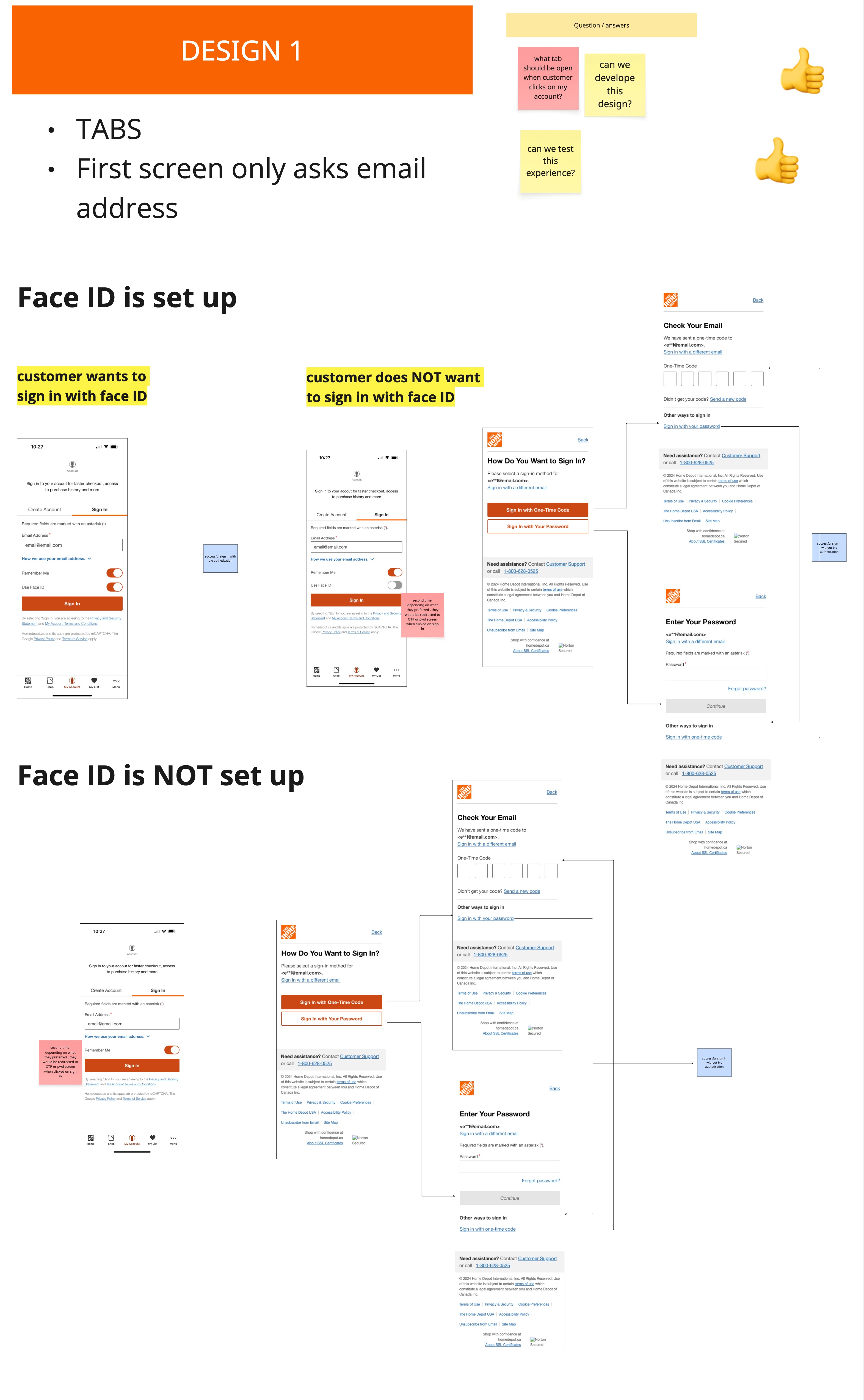
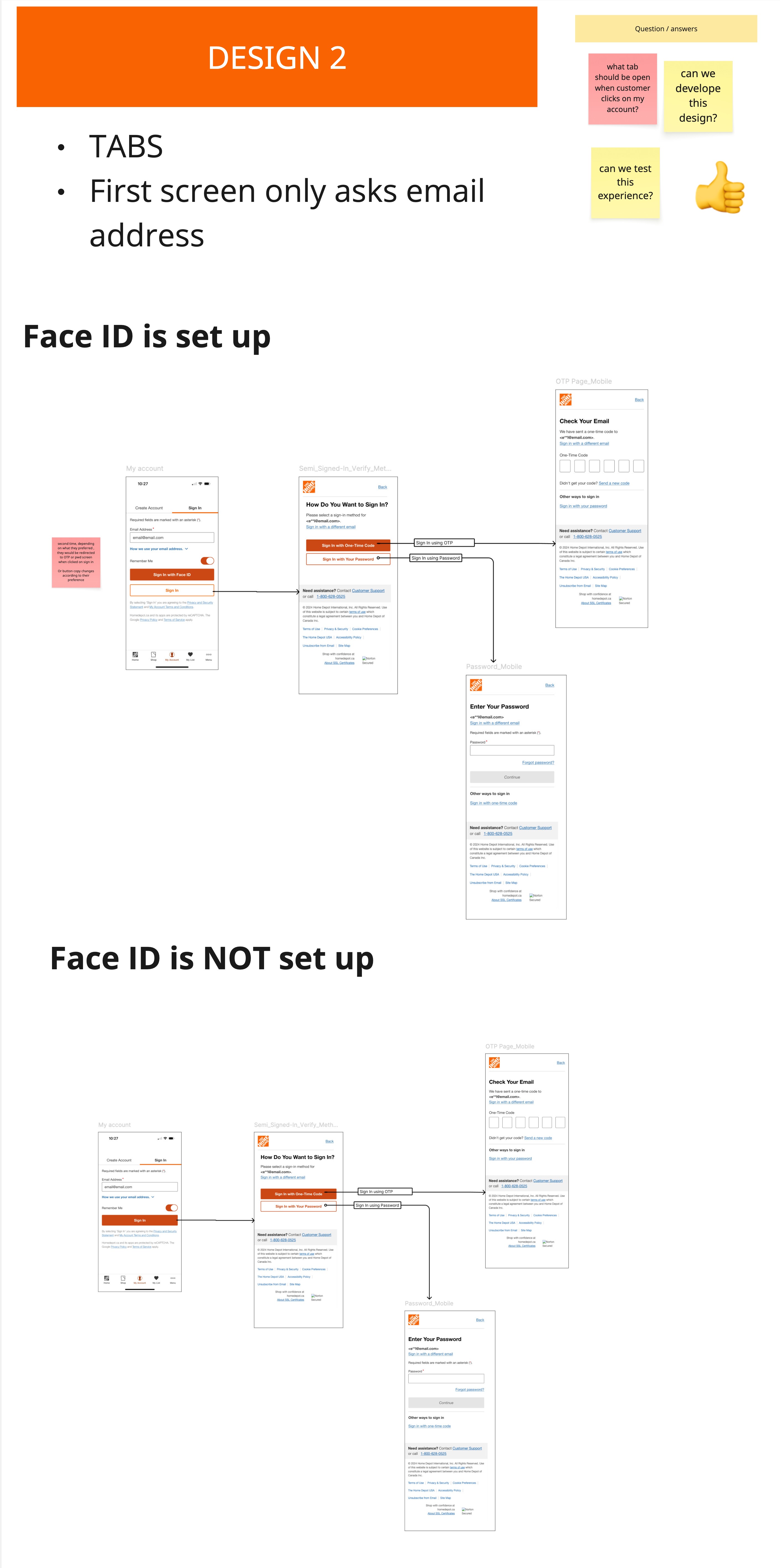
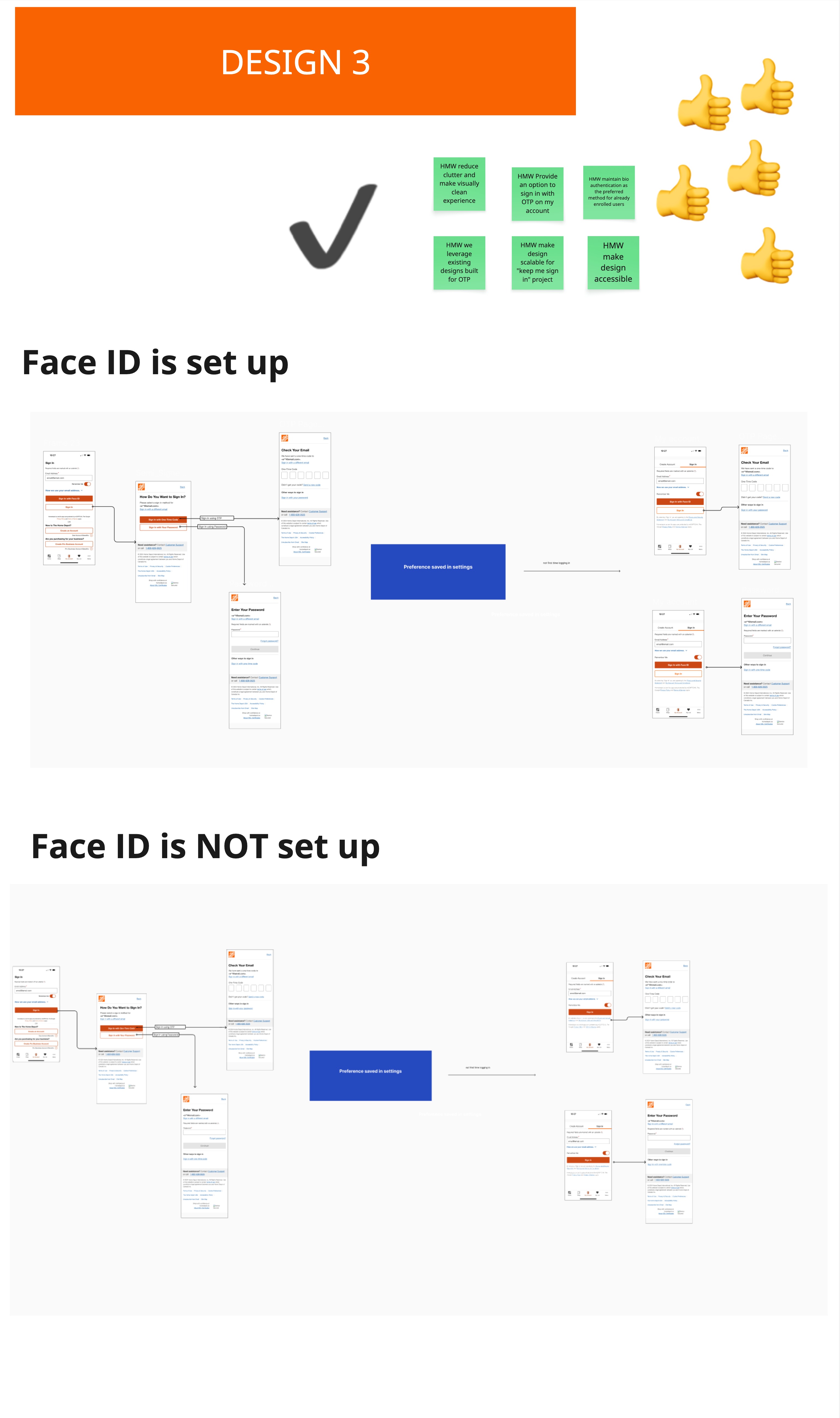
Given the compressed project timeline, ideation didn’t follow a full “Crazy 8s” exploration, instead, concepts were shaped directly by conversations with stakeholders during discovery and kickoff, where the project’s scope and constraints were already becoming clear. While the current-state audit and competitive analysis surfaced several gaps in the broader sign-in experience, the agreed scope for this project was narrowly focused on introducing OTP as a new sign-in option not a redesign of the sign-in experience as a whole.
I translated stakeholder input into three design directions and presented them for review. Rather than defaulting to a single recommendation, we ran a voting exercise with stakeholders to align on direction early, which shaped the design that moved into the next phase.
Final Design
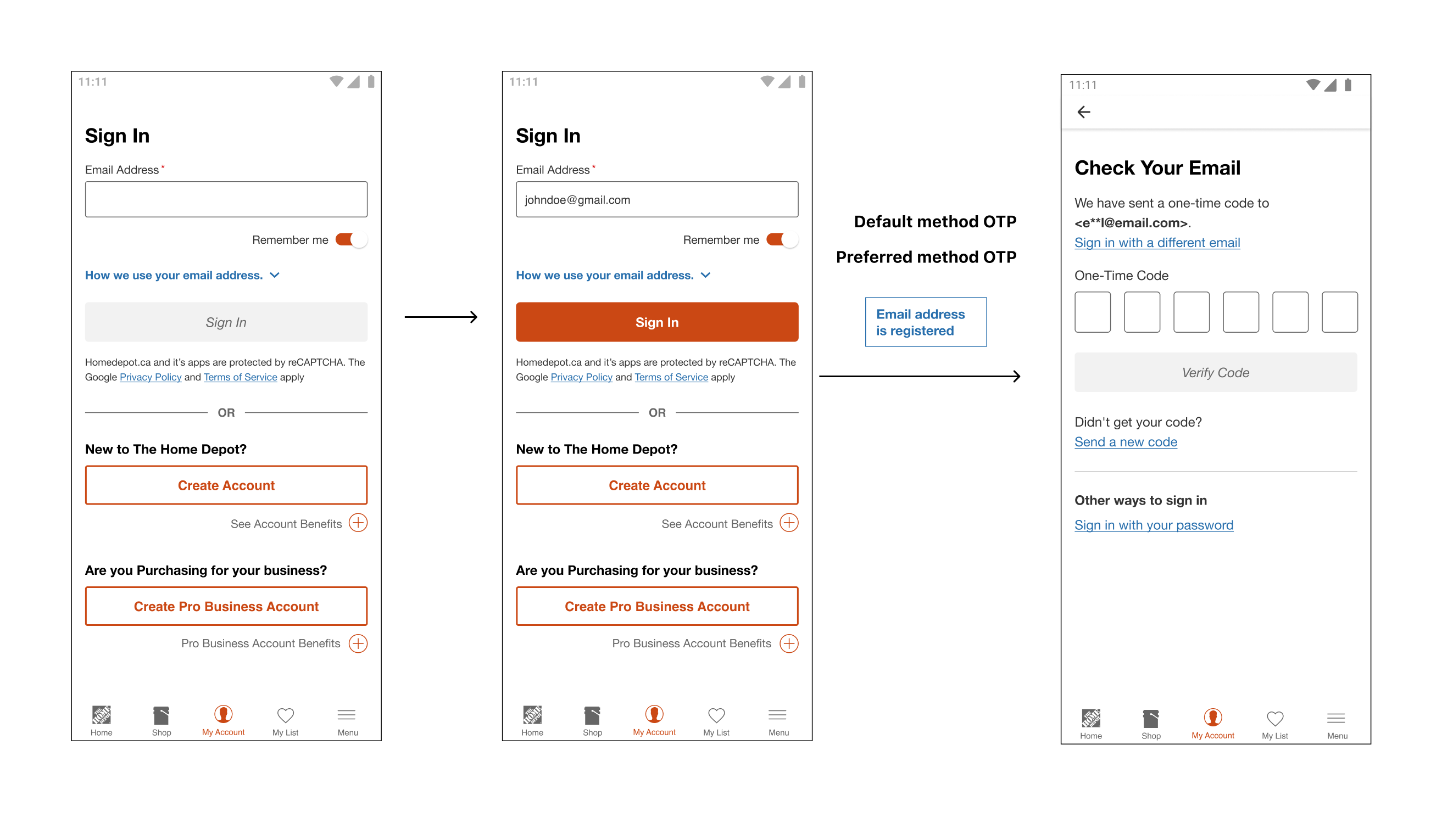
The voting exercise pointed clearly toward one direction, but it still had to hold up against everything we’d gathered earlier the audit findings, competitive patterns, and Baymard’s form guidance. I went back through those inputs to refine the selected concept: aligning field placement and error handling with best-practice guidance, keeping OTP visible but secondary to biometrics and making sure the flow didn’t reintroduce any friction the current-state audit had already flagged. A few rounds of internal alignment followed, refining copy, timing, and fallback states rather than direction.
Since this was going into production, the design also had to hold up beyond the happy path. Key edge cases we resolved:
- Code doesn’t arrive — resend option with a visible cooldown timer, plus a fallback to password
- Webview vs. native app — consistent OTP behavior whether the user hits sign-in from checkout or the main app
- Preference persistence — a biometric-enrolled user authenticating via OTP once doesn’t override their stored Face ID preference
Test & Reiterate
Before shipping, I ran an unmoderated usability study to validate the OTP flow, catch usability issues in the edge cases we’d designed for, and confirm the design didn’t unintentionally confuse users who were already comfortable signing in with biometrics.
What we tested: A clickable prototype of the sign-in experience with OTP, covering both the entry point (choosing OTP from the sign-in screen) and the full code-verification flow, including the resend and fallback-to-password states.
Study composition:
- 8 unmoderated tests via UserTesting.com (5 new customers, 3 current customers)
Focus areas:
- Discoverability — Could users find and understand the “Login with OTP” option without it being explained, and did they know what to expect when they tapped it?
- Task success & flow comprehension — Could users complete sign-in end-to-end, including reading the code-entry screen correctly (email vs. text expectations, number of digits, where to look for the code)?
- Trust & clarity of copy — Did the masked email display (e.g.,
e**l@email.com), “Didn’t get your code?” messaging, and “Other ways to sign in” language read as clear and trustworthy, or raise hesitation?
What we found / What changed
At a high level, the flow performed well users understood how to initiate OTP sign-in, located the code without confusion, and completed the task successfully across both new and current customers.
Two pieces of feedback stood out, though, and shaped what came next:
- SMS preference over email — Several users noted they’d expect (and prefer) a text message over an email for a one-time code, since it’s faster to access without leaving the app or switching context. This echoes NN/g’s own research on OTP delivery, and is a strong candidate for a future iteration if SMS becomes available as a channel.
- No visible expiration window — Users weren’t sure how long they had before the code expired, which created some hesitation, especially if they paused before entering it. Based on this, we added a visible expiry indicator on the code-entry screen, so users know exactly how much time they have left rather than guessing or assuming the code is still valid.
Deliver
I produced Figma specifications for every component state and worked directly with engineering through a phased build review process.
Deliverables Produced:
- Figma component library with states
- Annotated interaction behavior
- Variant OS specific variants
Cross-Functional Work:
- Design QA period caught critical rendering issues before moving to UAT
- Post-launch monitoring: weekly check-ins for four weeks to surface and resolve production edge cases

