Case study · E-commerce
Redesigning the way we communicate fulfillment options on the Product Information Page.
The fulfillment area on the Product Information Page (PIP) was last redesigned in 2017, which is forever ago in e-commerce. Our main goal was to meet and exceed customers’ expectations about available fulfillment options, offer the easiest way to compare them, and highlight Express Delivery as a new way to get items.
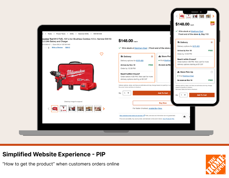
Overview
Impact
$80M
in GD
$35M
in-store attachment
$5M
in fulfillment cost savings
15 mo
from identifying the problem to launch for 100% of users
The project got huge visibility on all levels, with dozens of stakeholders involved. The final result was well received among the VP of Merchandising and other executives.
Team
2 Designers, UX copy writer, Product Team, Fulfillment Team, IT partners
My role
- User interviews with business reps
- Conducted user research and usability testing
- Led the end-to-end design process
- Ensured accessibility standards are met
Context
Understanding various fulfillments
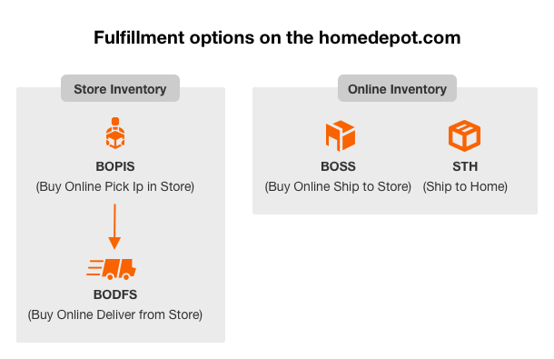
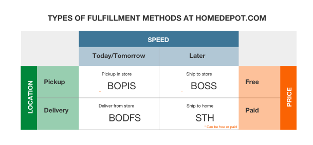
Currently, Home Depot offers users four options to get their desired products, in different combinations depending on the item and its availability:
- BOPIS (Buy Online Pick Up in Store)
- BOSS (Buy Online Ship to Store)
- STH (Ship To Home)
- And the most recent, faster delivery called BODFS (Buy Online Deliver From Store), presented to users as Express Delivery, Same-Day Delivery, and Next-Day Delivery.
Even though “Ship to Home” and “Express Delivery” could look alike to users, they are very much different options sourcing-wise. To figure out how to communicate a variety of fulfillment options to use, we needed to find
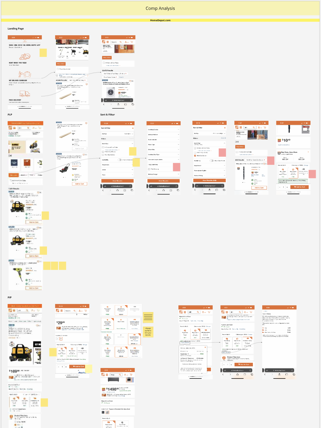
Evaluating the current experience
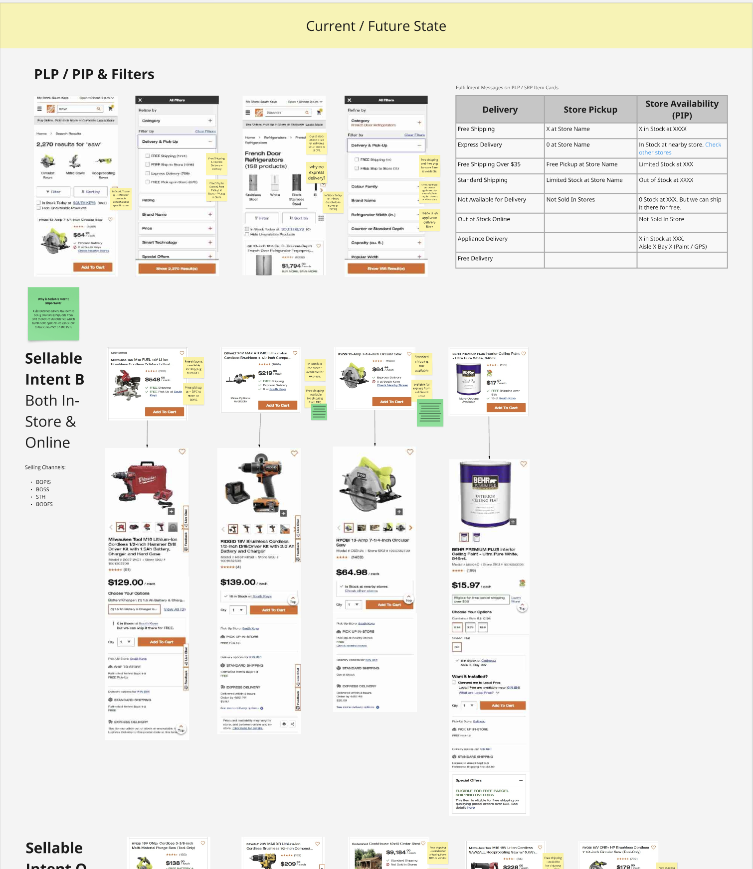
- There are a combined 6 different fulfillment types we currently communicate with our customers: Standard Shipping, Same Day Delivery (Express), Scheduled Delivery, Pickup In Store, Ship to Store and Appliance Delivery.
- These fulfillments are all communicated to customers in slightly different ways throughout the path to purchase.
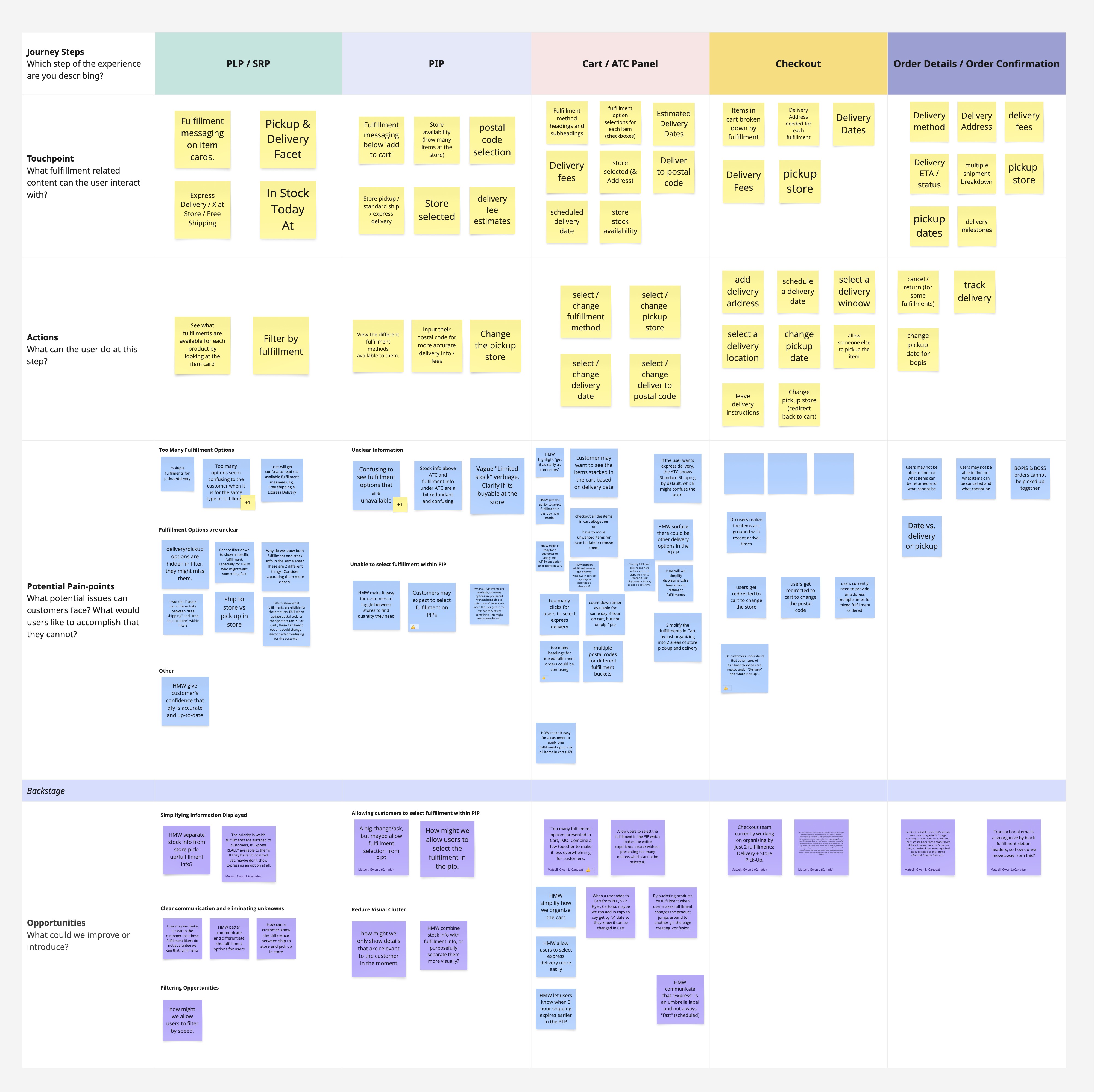
We evaluated the existing customer journey through a combination of user interviews, session analytics, and support data. The journey map revealed key friction points during onboarding and checkout, where users felt confused or frustrated. These findings highlighted opportunities to streamline flows and improve content clarity, which became focal points in our redesign objectives.
Users
Empathizing with users
You can find yourself in very different circumstances while shopping at homedepot.com. The same person can be in a rush to purchase a box of nails they just ran out of and need to pick up more ASAP, or buying multiple items for an upcoming bathroom remodel, or trying to get a grill delivered before the party on Saturday. In each of these cases, the buying behavior will be different, as will their values. Our job is to provide the right information at the right time for each user.
Each group of customers has its own needs, and although there are definitely some opportunities to tailor the experience based on our predictions about the group the customer falls into, the reality is that we have to be ready to satisfy all groups at the same time.
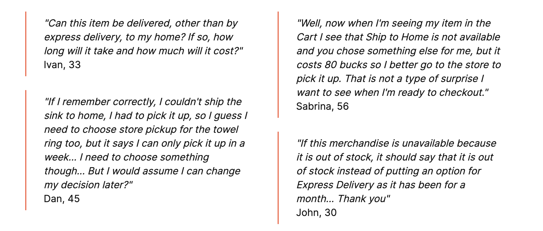
Over the past year of consistent research, from extensive baseline studies to feature-specific user tests, we saw and heard our customers experiencing the same difficulties over and over again.
Our research also showed that choosing a fulfillment option is a critical decision point for The Home Depot’s customers. Many of our users shop by project, not product, buying many items at one time. It’s crucial for them to get these items at the same time and preferably the same way. The nature of home improvement and construction projects requires transparency and ease of use, resulting in increased conversion and long-term loyalty.
UX research
What the research told us
For the research, we went through all the decks available within Home Depot related to fulfillments. I researched NN/g, Baymard and other resources to find best practices and recommended UX approaches. Here is the research summary:
01
Delivery dates vs. delivery speeds
- Be specific about estimated delivery dates, rather than ambiguous “delivery speeds” like 1–3 business days.
- Delivery speeds require users to do the calculations themselves and consider multiple variables: whether order-processing time is included in the shipping time, what a “business day” is and how it affects the delivery date, and shipping cutoff times that decide what counts as today or tomorrow.
- When given a delivery date, all users need to consider is whether they are willing to pay the extra cost to receive the item faster.
Guidelines to follow
- Accurate delivery dates need geotargeting or a postal code, so let users know the dates they see are preliminary estimates that may change when they enter their address during checkout.
- When cutoff times are involved (4 p.m. for express orders), consider a countdown timer so users know the condition for the estimate.
02
Clear labelling and organization of omnichannel delivery options
- Although “store pickup” and “ship to store” have existed for years, Baymard’s testing shows the concepts are still unfamiliar to some users.
- Subtle differences between the options and their names confuse many users, for example “Store Pickup” and “Ship to Store”, or “Shipping” and “Delivery”.
- Fulfillment options should always use non-branded labels. Labels like “will call” or “ship2store” make the decision harder (consider “Express Delivery”).
- What each option means needs to be explicit. In testing, participants often assumed that any option involving a store visit meant the items would be available the same day.
Guidelines to follow: spell out the differences
- When will the item be available for pickup?
- What is the stock availability for store pickup?
- How long will the item be reserved for?
- When will the item be delivered?
- What are the cost implications of each option?
- What are the cutoff times for express?
- What are the available time slots for delivery? (DW&S)
Stakeholders
Aligning the stakeholders’ vision
Mapping the problem space
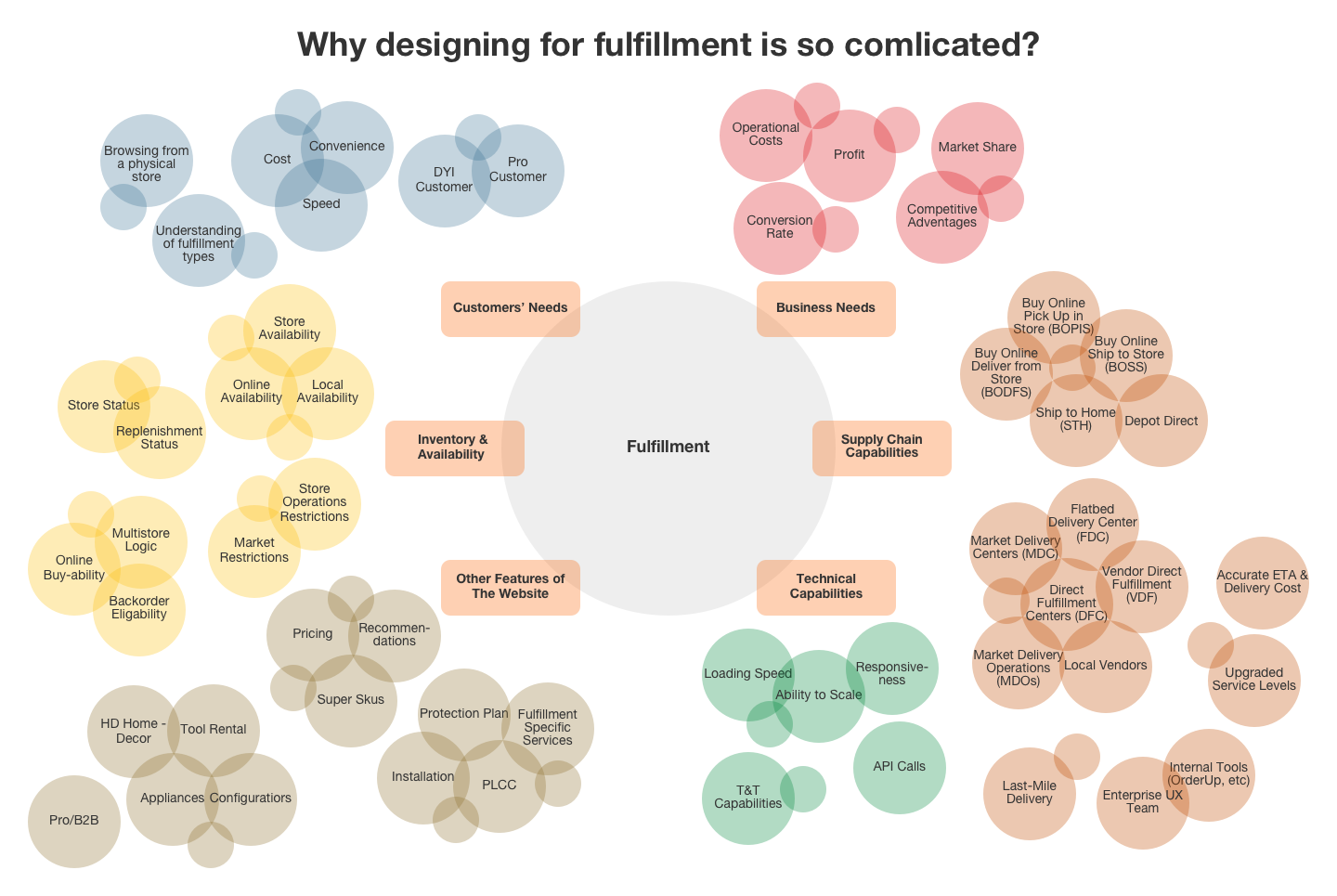
The reality of working in such a huge infrastructure as homedepot.ca, especially in a cross-disciplinary area like fulfillment, is that the designer always needs to look at the problem from multiple angles. On top of the usual user and business needs, we had to account for supply chain capabilities and all the complexity that comes with them. Discovery was the longest and most difficult part of the project. The stakes are always high when you work on something as tied to conversion rate as fulfillment.
This project gave us an opportunity to dive deep into the Home Depot world outside of what a normal UX design job is. We got to sit at tables we wouldn’t normally sit at and be part of more strategic decisions than we normally would.
Aligning the vision inside the company
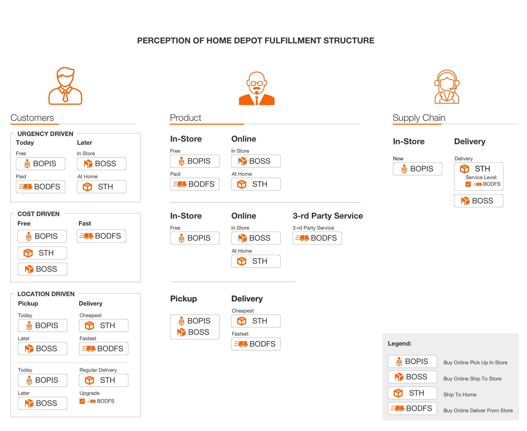
While we still hoped our biggest problem was the placement of the fulfillment area on the PIP, we discovered something interesting: there was no shared vision of the fulfillment structure across the company. The customer vision, the product owners’ vision and the supply chain’s vision did not match.
This led to multiple conversations with high-level executives where we crafted a new shared understanding of the fulfillment options. We discussed our long-term goals (a massive supply chain expansion), our existing infrastructure and multiple squads’ roadmaps, and landed on a “meanwhile” solution: three equally important fulfillment methods for customers, Store Pickup, Ship to Home and Express Delivery. Now we were ready to start ideating, prototyping and user testing. Well, almost.
Goals
Setting up the redesign goals
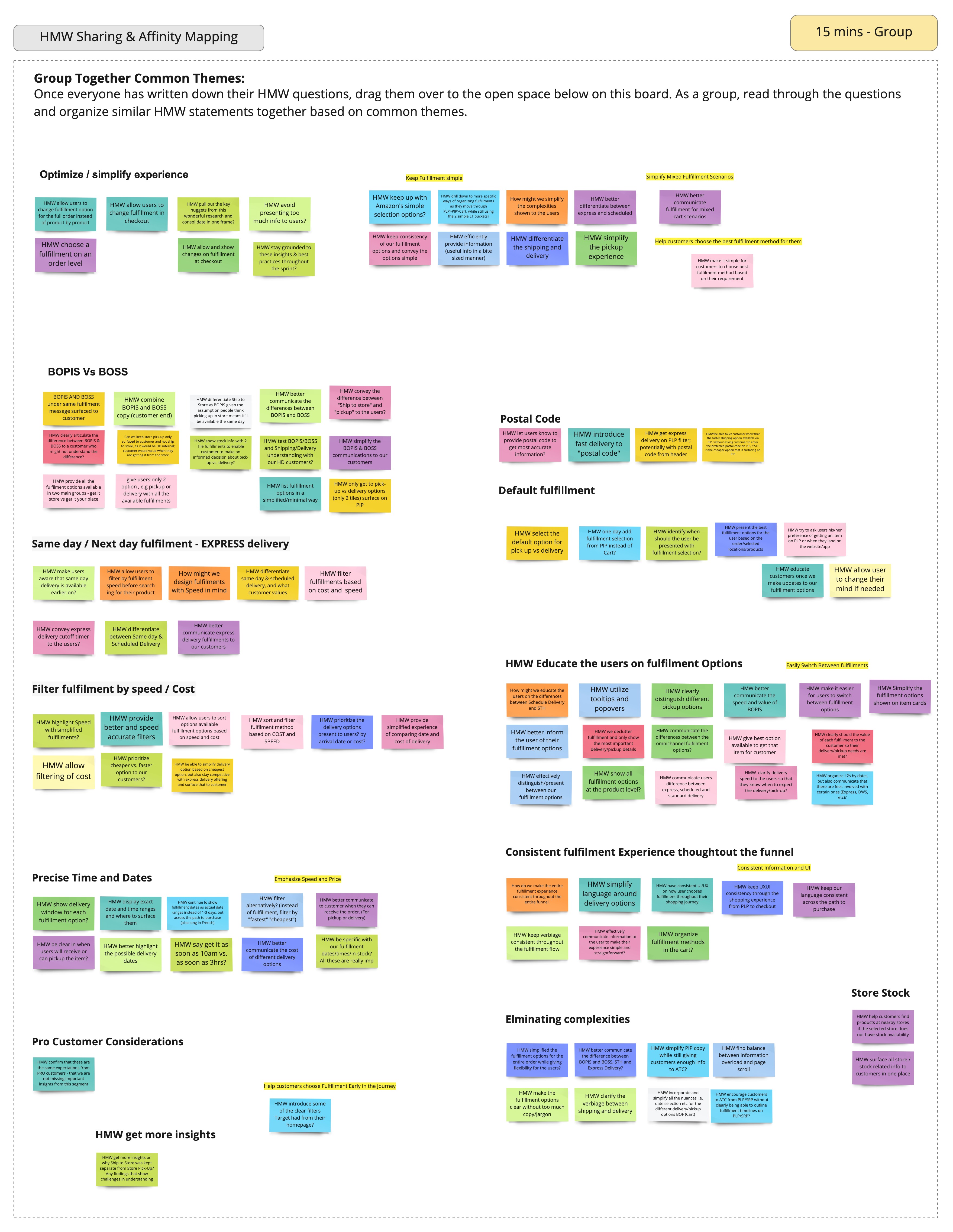
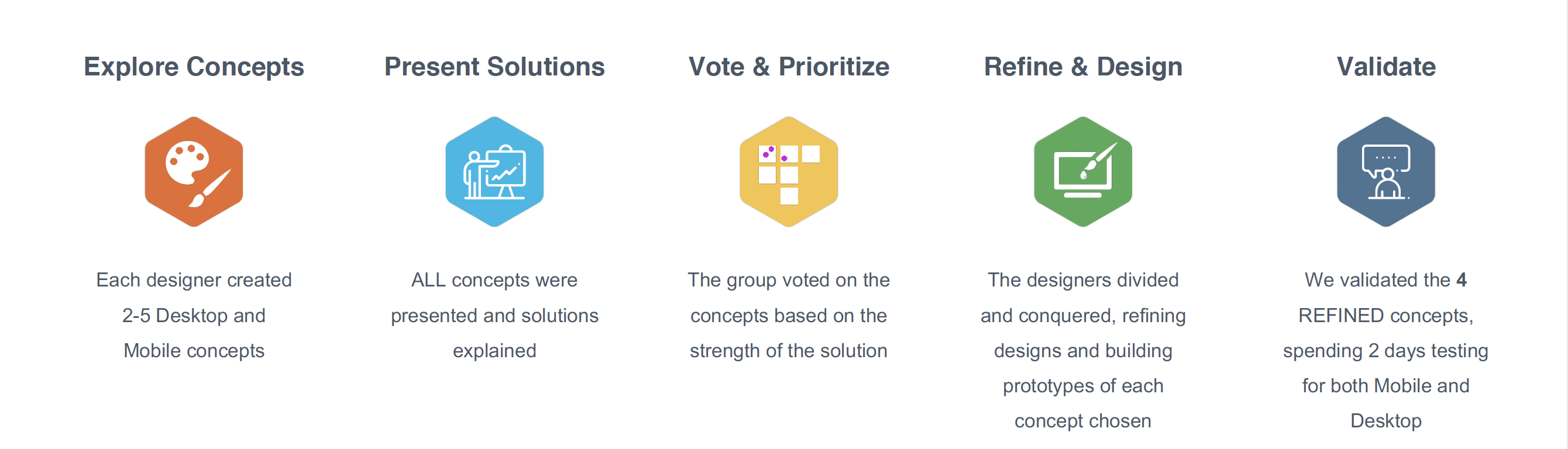
During the UX kick-off, as we went through research and competitive analysis, we asked each participant to write “How Might We” notes to catch all the problem areas. We then did affinity diagramming and came up with a list of the main opportunities to improve the customer experience.
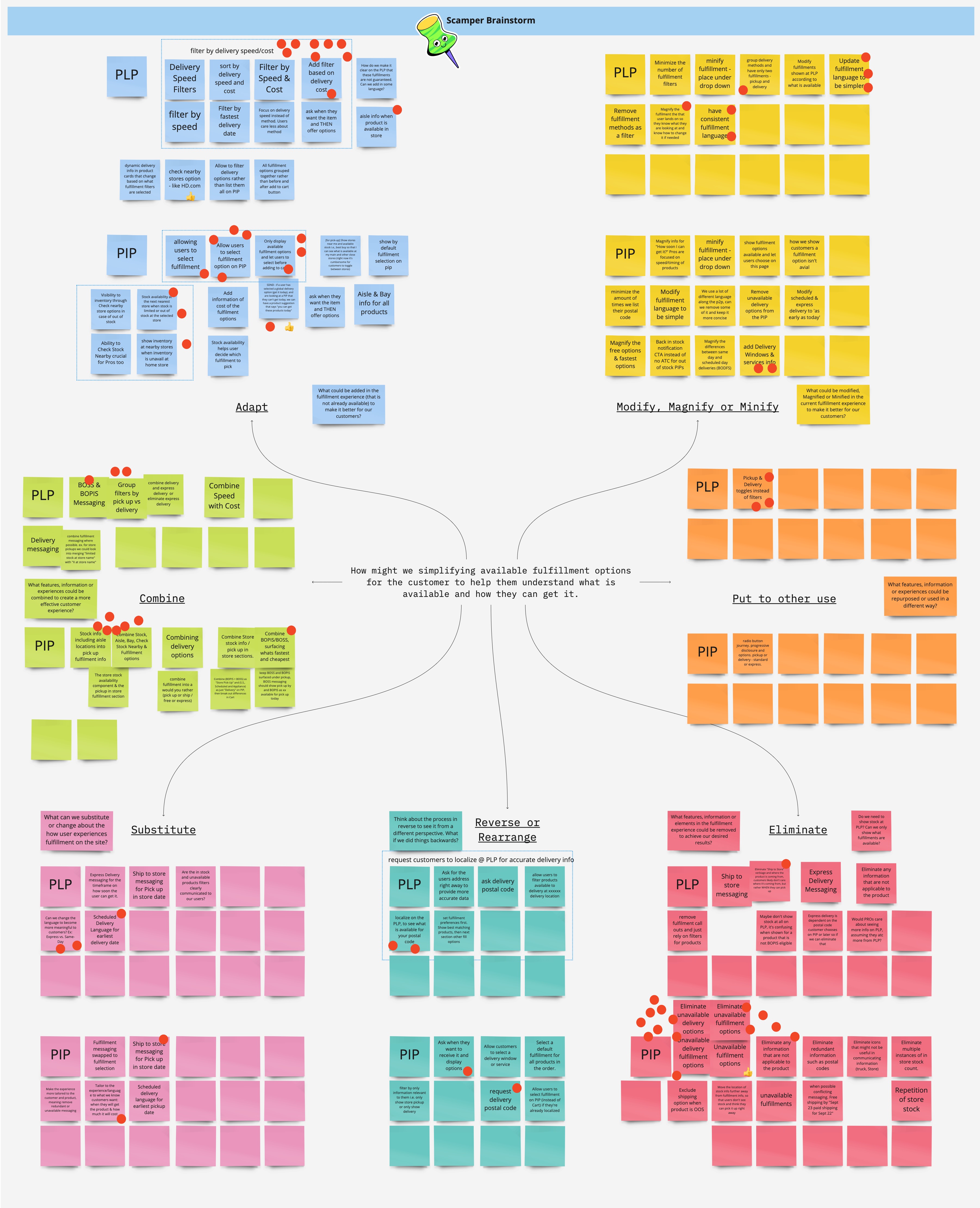
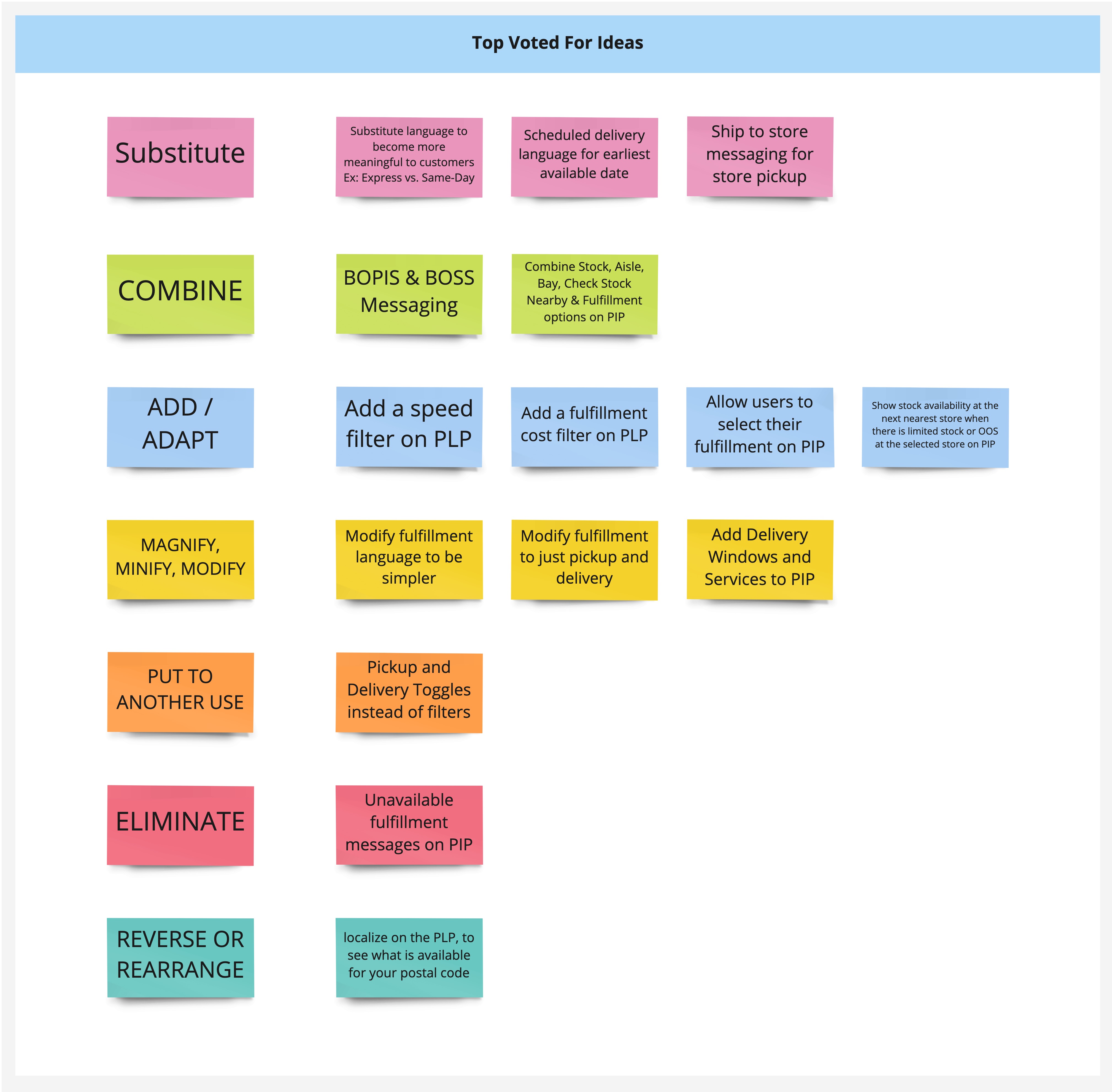
We also did SCAMPER brainstorming with the larger team, including stakeholders from various teams. SCAMPER is an acronym for seven techniques: (S) substitute, (C) combine, (A) adapt, (M) modify, (P) put to another use, (E) eliminate and (R) reverse. These keywords are the questions addressed during the creative thinking meeting. At the end of the brainstorm, we set a 15-minute timer and asked the team to vote for the sticky notes in each section.
Ideation
The creative party: UI design sprint
Starting with pen and paper
We knew what we needed to solve for and our users’ needs. Now it was time to dip our toes in the water and find the best way to conceptualize our ideas.
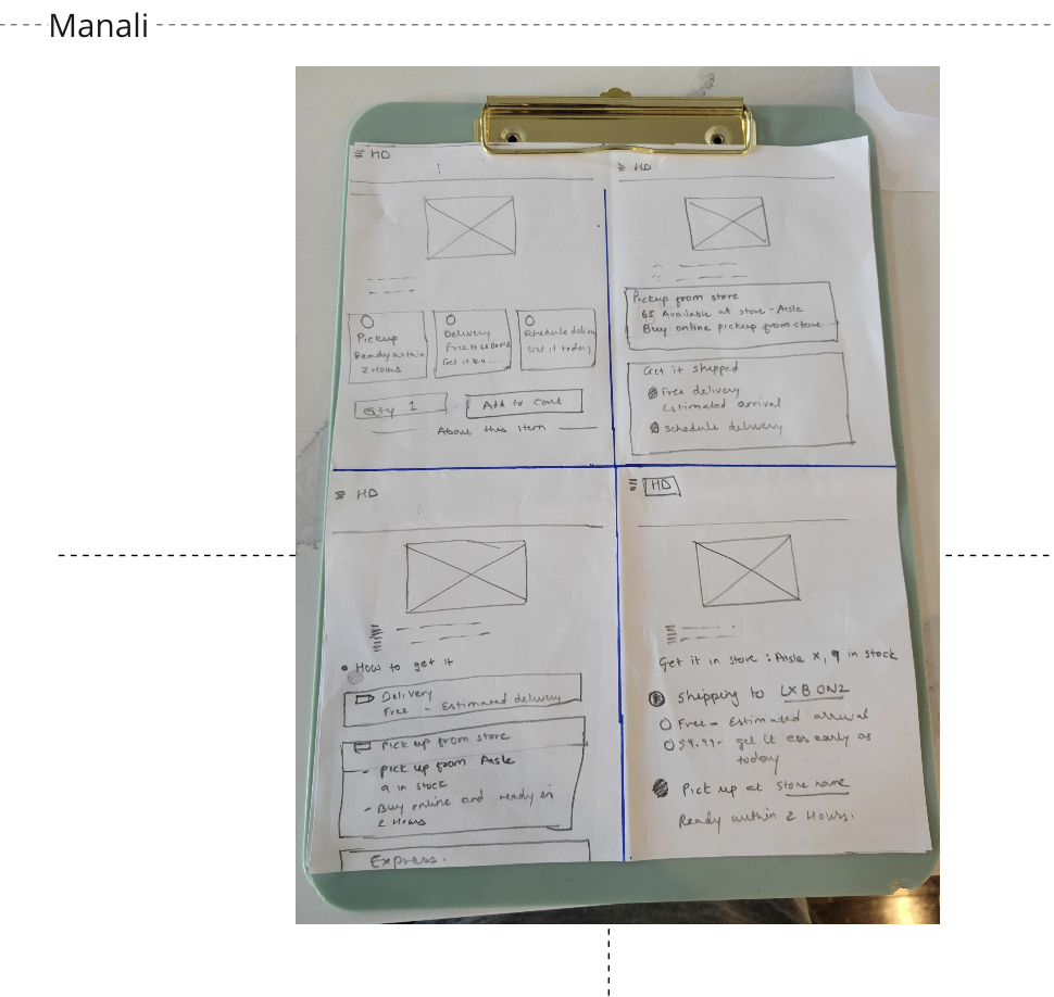
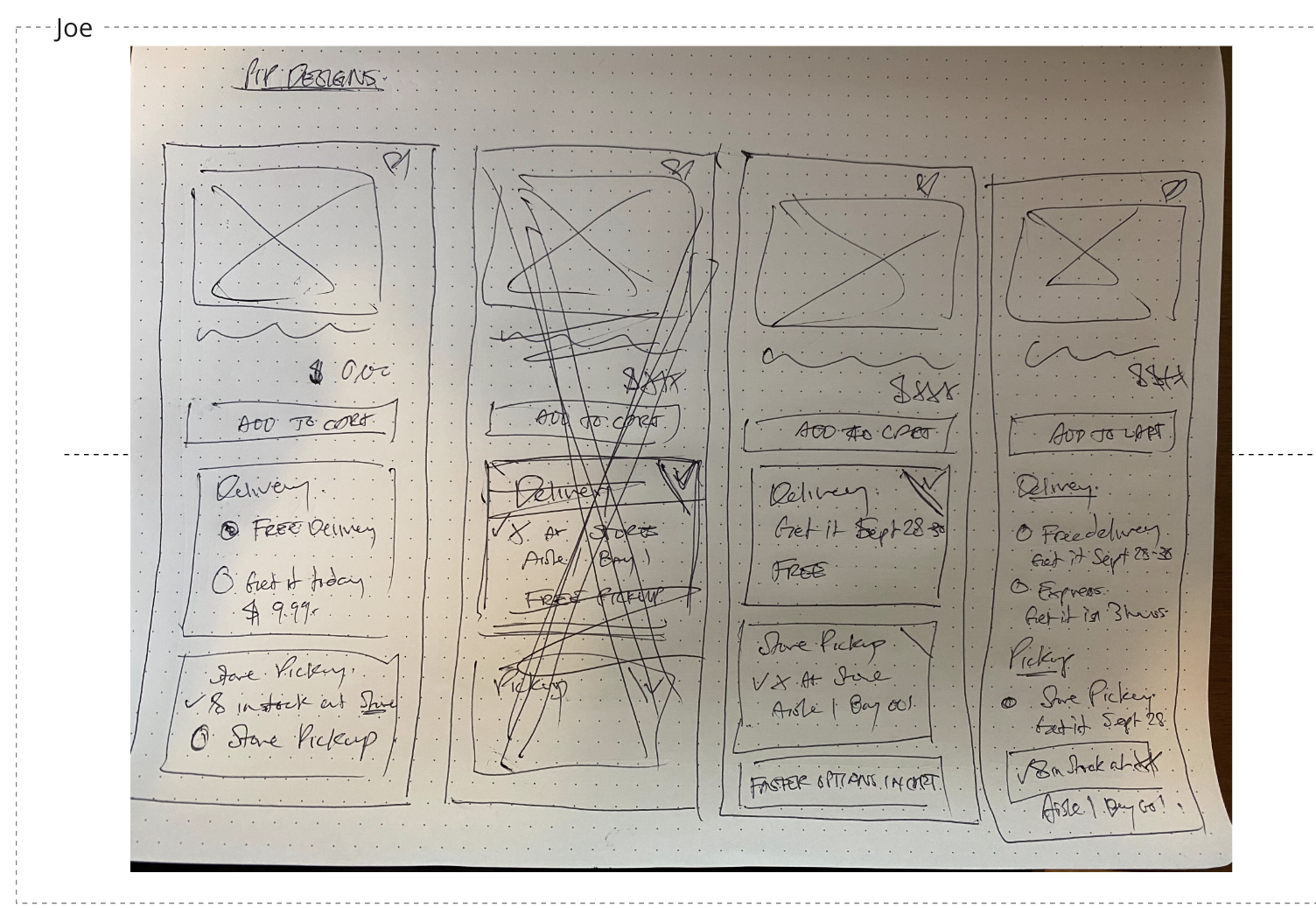
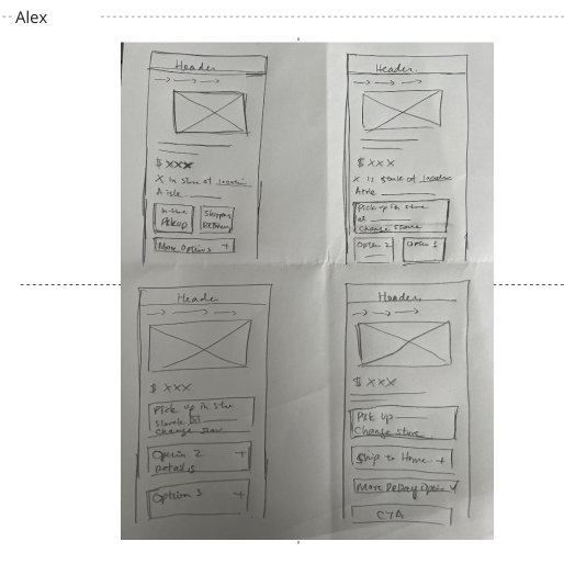
To bring in expertise from designers who don’t design for fulfillment directly but whose work would be drastically affected by the redesign, we invited two designers from other teams to look at the problem with fresh eyes, and combined that with our deep knowledge of the business logic behind fulfillment. On day one of the design sprint (we call it a design sprint even though it wasn’t exactly one), we started with Crazy 4s, took those ideas forward, and then the core design team presented designs to all the teams.
Crazy 8 exercise
We did a Crazy 8 exercise with the core team, managers, and stakeholders from the product and business teams, everyone whose projects touch fulfillment. More than 10 people took part. Here are some of the sketches.
Design
Design concepts
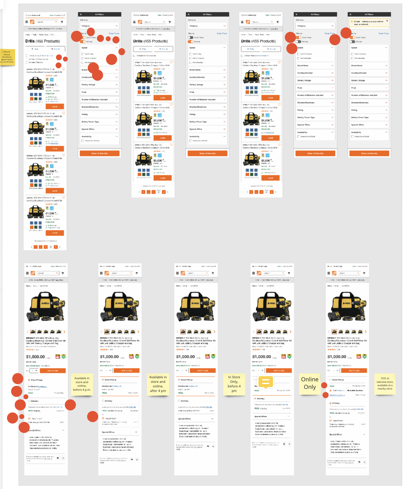
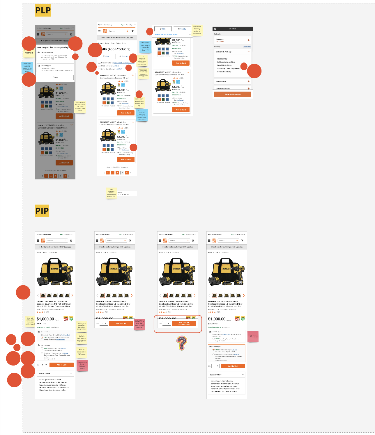
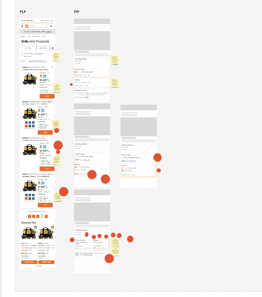
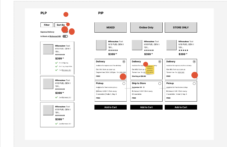
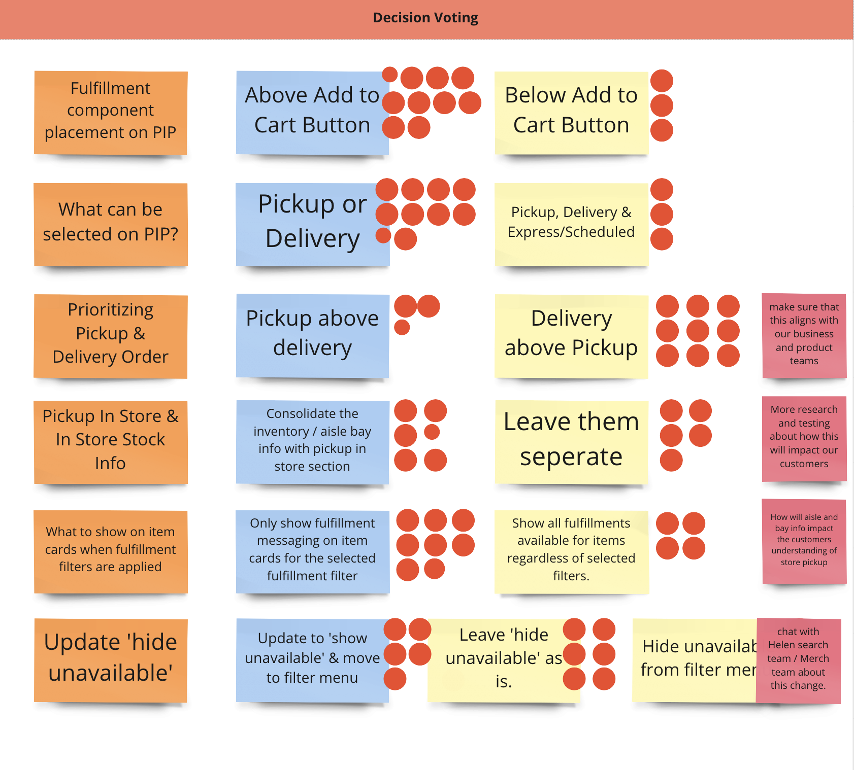
We designed four concepts based on all the sketches from the Crazy 8 exercise. We reviewed each concept with the larger team and asked everyone to vote for what they liked in each one.
What the vote decided
We had a strong feeling that showing all the details for each of the three fulfillment methods would cause cognitive overload, but we weren’t sure what we could remove or hide. With so many stakeholders in play, it felt like there was nothing we could do about it. At the same time, leadership feedback was clear: “Well, you HAVE TO remove something.”
After analyzing what worked well in each concept, even the ones that weren’t successful overall, we found what was missing from our leading two-tile concept: progressive disclosure.
We knew fulfillment details are very important to our customers. We knew they want to compare their options easily. But we also knew those options get wordy and hard to understand. So what do customers really HAVE TO KNOW to compare their options?
Price — Speed — Pickup vs. Delivery
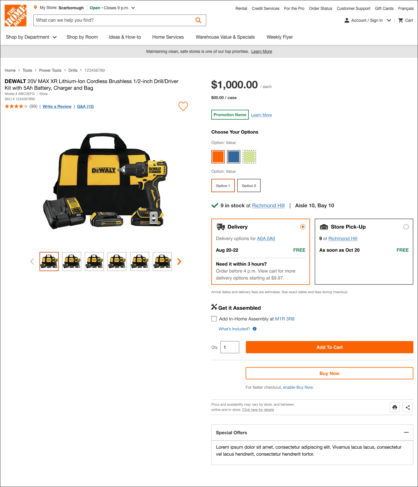
So we kept those three key points inside the tiles. As a result, we landed on a simple concept that highlights the main points, is easy to compare, and lets customers learn more details on click. At the same time, users can click “Add to Cart” with the default fulfillment option and make a decision later in Cart.
Final designs

Validation
Scenario mapping and user testing
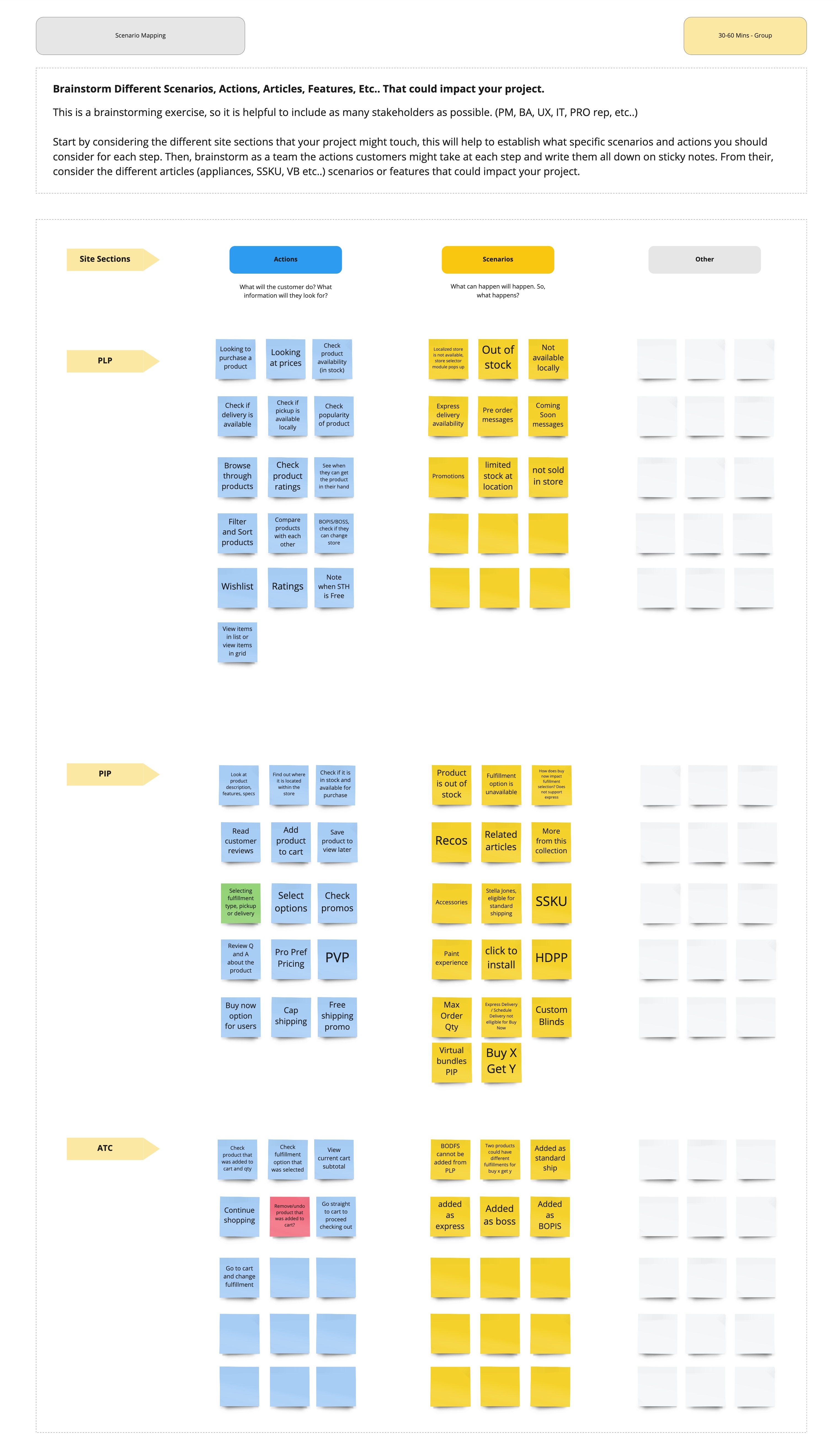
Scenario mapping
Before testing with users, we wanted to make sure the solution worked for all the edge cases and possible scenarios on the PIP. We brainstormed with as many stakeholders as possible and considered the site sections directly related to the PIP.
Validating the design with UserTesting
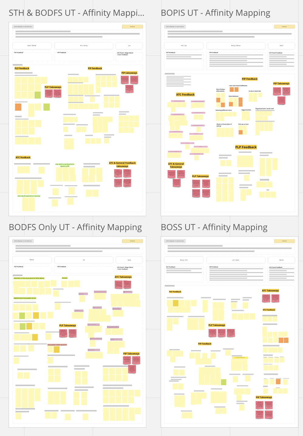
To validate our concepts, we ran 4 unmoderated mobile tests on usertesting.com, one for each fulfillment. We defined research objectives, user goals, assumptions and behaviors, then wrote directions on how to complete each test.
We built the prototype in Figma and were careful with all the data so users would get as close as possible to the live experience.
After the tests, we exported all the feedback from UserTesting and organized it by task and question. We grouped it into common themes across all the tasks, then shared the learnings and takeaways with the larger team.
Based on what we learned, we made some minor changes to the design, and it was ready for development!
Reflection
What I learned from this experience
01
It never goes as planned.
The process is messy, and that’s alright. Sometimes it’s hard to tell a nice, simple story out of a year of hard work, dozens of stakeholders and ever-switching priorities.
02
Let the numbers speak.
As much as we love and value qualitative research, there is always room for hard data. If users love your design, let them show it in dollars. It’s a business, after all.
03
Somebody’s got to be the vision keeper. It might have to be you.
Being a solo designer on a project the whole company is invested in is hard. It’s a great exercise in finding your voice, making it heard, and keeping the vision straight when it feels like every single piece is moving.
04
Hooray for the team effort!
As scary as it might feel, bringing more people with different expertise into the project is always a good thing. As long as lesson three is being learned and practiced along the way, involving more people to share their viewpoint and advice helps. At the same time, more decision-makers can create a “too many cooks in the kitchen” situation.
Even though it doesn’t look that big on paper, this project was the core of my work life, from identifying the problem to launching the final solution for 100% of users. I gained expertise in a subject that every designer at the company needs help with at some point. Now all of it is well documented and available to designers and product managers at the company, without having to rely on any one person.

